Posted By: Viraj
Published Date: March 20, 2023
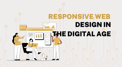
We are living in a technically fast-moving world where everyone is making use of technology effectively. The number of people using mobile phones is very high along with the advancement in technology. The changes in the search engine’s algorithms also push forward the importance of a responsive web design. All those who are in need of a website also require a mobile version of the website or a mobile app too. As we said there are a larger number of mobile users in the world, so if u want to reach your business higher you must consider those mobile users also. The internet and technological advancements have made it possible to access the internet whenever and wherever you want. Anyone can easily look into any website, e-store, and any information on their mobile phone according to their comfort. The majority of people use their phones and the internet frequently. Thus, you should consider mobile users if you want your business to succeed and grab the attention of a larger group of users.
Why you need a responsive design?
Smart devices are available in the market in various forms like mobile phones, tablets, laptops and computers. The size of these electronic devices varies from device to device. It is more difficult to develop any website or application that perfectly suits every screen size flawlessly on all devices. Responsive designs are used to overcome this difficulty faced by the developers. A responsive design method allows you to create a website, app, or any digital product that is automatically sized according to the screen size so you don't have to design and develop them separately for each device. The designs that are perfect for mobile users have higher chances of ranking higher in the search engine. This ranking is carried out according to the algorithms of a search engine. The requirements of a search engine are satisfied by utilizing a responsive design. Your website will fall behind your competitors in search engine rankings if you do not optimize for mobile users. The perfection and ease of usage will increase traffic to your website and thus SEO(Search Engine Optimization) ranking of the website will be enhanced.
A website can function in a responsive manner by adjusting to the environment by designing using Responsive Design. It is the most useful web design technique that allows the website to acclimate to the screen size of the device. This automatic adjustment made by the websites will deliver a delightful browsing experience to the user. To make perfect adaptation a responsive design utilises flexible layouts and grids, images, and CSS media queries. With a responsive design, a website can automatically adjust to the resolution and can adapt to new sizes of text and images that can fit the screen size. Accordingly, responsive design allows the website to vary its response based on users' preferences. As a result, each device on the market will not require an individual code to be designed and developed.
Adapt to the future with Gedexo
A variety of resolutions are constantly being added to mobile devices and laptops. With endless new resolutions and devices, it's very difficult to keep up with web design and development practices. Step ahead into the feature with creative and responsive designs from the best website developers in Calicut. Gedexo Technologies is the leading website design and development company in Calicut that delivers fruitful websites that are responsive for the ease of the users. Rise with the best in the industry to make the best benefits from your business. Get in touch with us if you are interested in creating a responsive website or designing a responsive website for your business.